The first thing I noticed about WISHARAWISH’s Spring/Summer 2027 collection was not a particular color, fabric or silhouette. It was how difficult the clothes were to pin down.
A jacket could begin the conversation like traditional menswear, then expose the entire torso beneath it. A pair of trousers could carry the visual energy of a painting. Metallic surfaces appeared beside quieter woven patterns. Shorts became companions to tailoring. There was always another ingredient entering the picture.
That makes sense for “Salade de Fruits,” the name WISHARAWISH gave the collection it presented at Rakuten Fashion Week Tokyo. Inspired by French singer Bourvil’s playful song “Salade de fruits,” the concept considers how different colors, flavors and elements can exist together. WISHARAWISH translates that idea into clothing through botanical prints, fluid silhouettes, silk, handwoven textiles, metallic threads, batik, embroidery and foil work.
What could have become a literal exercise in sweetness instead became something far more interesting: a study in combination.
This was WISHARAWISH’s fifth appearance at Rakuten Fashion Week Tokyo, and that experience showed. The collection never seemed nervous about putting another pattern, texture or flash of skin into the equation. For menswear especially, I found that refreshing. These clothes did not ask men to choose between masculine and delicate, tailored and sensual, serious and playful.
Why choose at all?
Mixed signals

The collection’s mixing instinct becomes immediately clear in this combination of plaid, graphic pattern and decoration. A cropped jacket in washed turquoise, gray and cream sits above a small embellished panel, while black-and-white patterned trousers fall below the knee.
I particularly like the jacket. Plaid is familiar territory, but shortening the proportions and leaving the torso largely exposed changes its personality. Something associated with casual dressing suddenly becomes flirtatious.
Then WISHARAWISH refuses to give the eye an easy matching set. The graphic trousers operate on another frequency entirely. Instead of competing, the patterns create a kind of visual conversation. It is like looking at scraps from different drawings pinned to the same studio wall and realizing they make more sense together than apart.
Graphic current

Black and white take control here, but simplicity does not.
A long patterned shirt opens dramatically over the stomach before meeting loose trousers marked by vertical streaks. The shirt’s dense geometry moves in several directions while the trousers pull the eye downward.
The contrast reminds me of Op Art, particularly the way repeated lines can make a static surface appear restless. But WISHARAWISH keeps the idea human by leaving the center of the body exposed. Skin becomes the quietest element in a look filled with pattern.
That is what makes it work for me. The body is not competing with the clothing. It becomes the pause between two visual sentences.
Quiet geometry

This look lowers the volume without abandoning the collection’s interest in pattern.
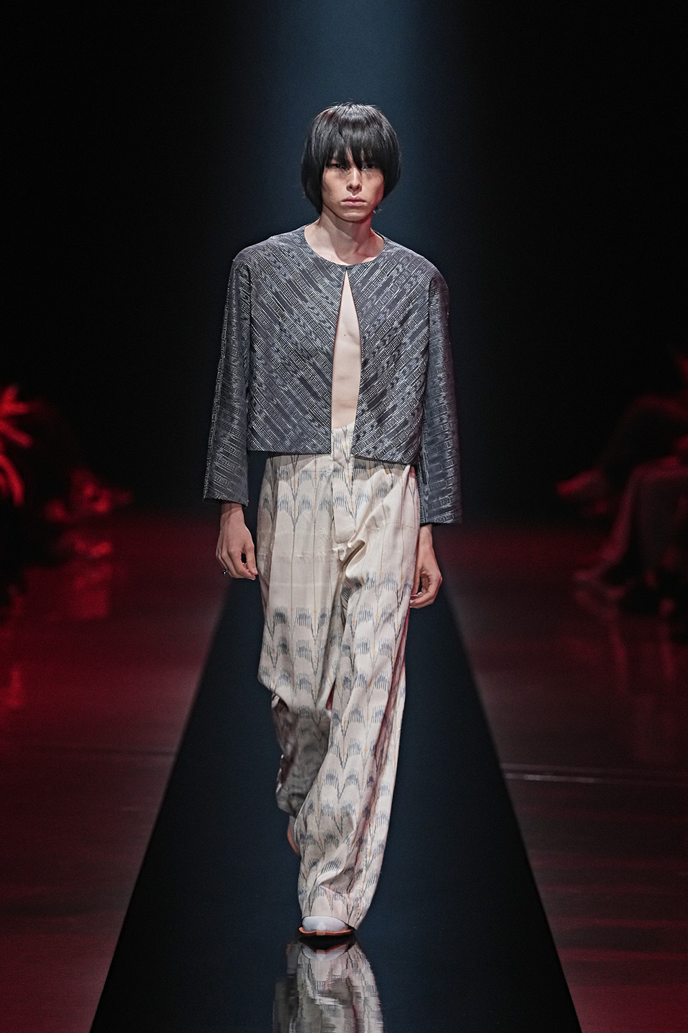
A cropped charcoal top parts neatly at the center, exposing a narrow strip of torso before meeting cream trousers carrying a softer repeating motif. The palette feels almost mineral, with gray, ivory and faint blue replacing the louder clashes elsewhere.
I love the proportions here. The short top makes the trousers appear longer, while the opening down the torso gives an otherwise restrained outfit a subtle sensuality.
There is also something architectural about it. The top feels like two panels that almost meet but deliberately leave a sliver of space between them. WISHARAWISH understands that absence can be as useful as decoration.
Fallen stars

A muted blue-gray jacket meets wide, knee-length bottoms scattered with metallic stars, and suddenly the collection seems to have wandered outside after dark.
This pairing fascinates me because the botanical texture of the jacket and celestial decoration below it create two different environments on one body. Garden above, night sky below.
The stars could easily have become novelty decoration. They do not. Their metallic surfaces interrupt the subdued fabric like tiny reflections appearing unexpectedly in water. Metallic boots continue that conversation at ground level.
There is humor here, but WISHARAWISH never needs to announce the joke.
New suiting

Then WISHARAWISH takes on one of menswear’s most familiar uniforms.
A double-breasted jacket and matching cropped trousers are covered in repeating blue marks, while the expected shirt and tie have disappeared entirely. Bare skin occupies the deep opening of the jacket instead.
This is exactly the kind of tailoring I want to see more often.
The recognizable ingredients of a suit remain, including strong shoulders, lapels and a coordinated bottom, but the rules governing them have loosened. Cropping the trousers exposes the legs. Removing the shirt gives the jacket a completely different relationship with the body.
It still looks dressed. It simply refuses to behave like office clothing.
Silver rhythm

Gray takes over almost completely in this look, giving texture the responsibility normally assigned to color.
A fitted patterned top pulls close to the waist before flowing into matching trousers. At the neck, a scarf kicks outward like a brushstroke escaping the canvas.
The surface appears to shift as the model moves beneath the runway lights, which connects naturally to WISHARAWISH’s use of handwoven silk and metallic threads. Rather than treating shine as something sprinkled on afterward, the fabric itself seems responsive to movement.
I kept returning to this one because it feels musical. Repeated markings move across the body almost like beats on a page, while the scarf provides the interruption.
Disco picnic

Then somebody turns the lights back on.
A metallic shirt and matching shorts scatter turquoise, silver and red across a dark base. A wide plaid band wraps around the waist, while a printed cap and electric blue boots add still more information.
There is a lot happening, and that abundance is precisely what gives the look its personality.
I see traces of disco in the reflective surfaces, but the styling drags that glamour somewhere stranger. A baseball cap sits above metallic fabric. Plaid interrupts the shine. Shorts expose the legs while the long sleeves keep the upper body covered.
If “Salade de Fruits” needed a visual explanation, this comes close. Different ingredients retain their individual flavors even after WISHARAWISH tosses them together.
After hours

This look brings tailoring back with sharper shoulders and a darker attitude.
A structured patterned jacket sits above embellished cropped bottoms, creating an interesting disagreement between the upper and lower halves. Silver and black dominate, but tiny reflective details keep disturbing the darkness as the model moves.
I like that tension. The jacket enters the room prepared for something formal. Everything below it appears to have made other plans.
That collision gives the outfit personality. WISHARAWISH repeatedly takes pieces associated with traditional menswear and introduces an element that changes the social rules around them. Here, tailoring does not disappear. It gets invited somewhere more interesting.
Blue static

Blue and cream return through a cropped open-front jacket and loose trousers covered in related but distinct patterns.
This is one of my favorite combinations in the selection because the pieces do not match in the conventional sense. They recognize each other without becoming identical.
The trousers carry blurred blue marks that look almost like pigment dragged across wet paper. Above them, the jacket introduces a busier, more textured surface. The exposed torso separates those patterns and prevents them from collapsing into one continuous print.
The result feels painterly without becoming precious. It reminds me of seeing different versions of the same color mixed across an artist’s palette.
Midnight fruit

Black becomes playful when WISHARAWISH covers a relaxed suit with tiny reflective embellishments.
At first glance, the silhouette reads as dark tailoring. Then the runway lights catch the surface and reveal dozens of little flashes. That delayed discovery is exactly what makes the look memorable.
I appreciate that WISHARAWISH does not reserve decoration for womenswear or treat embellishment as something that needs to be justified on a man. Here it simply belongs.
The open jacket helps. Bare skin breaks through all that black and prevents the outfit from becoming ceremonial. The effect resembles a city seen from an airplane at night, darkness punctured by hundreds of small lights.
Bare contrast

A long black coat frames a sheer, spotted shirt tied loosely at the neck, while very short patterned bottoms leave most of the leg exposed.
The proportions grabbed me immediately. The coat brings length and gravity, then the shorts abruptly remove almost everything between waist and shoe. Covering and revealing happen simultaneously.
I especially like the transparency of the shirt. It softens the authority of the coat and introduces another degree of exposure beyond simply showing skin. Each layer reveals a different amount of the body.
The clothes almost behave like curtains being pulled apart.
That sensuality never feels forced. WISHARAWISH simply treats the male body as another element available to the designer, alongside silk, pattern, shine and color. That should not feel radical in 2026, but menswear still benefits enormously from designers willing to expand what men are permitted to enjoy wearing.
Second helping
By the end, “Salade de Fruits” made more sense to me as an attitude than a theme.
WISHARAWISH is not asking us to look for fruit hidden in every print or decode Bourvil’s song through every garment. The more interesting connection is the act of combining. Sweet with dark. Tailoring with bare skin. Graphic pattern with botanical texture. Metallic surfaces with quieter cloth. Long coats with tiny shorts.
The collection also reminds us that craftsmanship does not have to arrive with a solemn expression. WISHARAWISH uses handwoven silk, metallic threads, developed batik, embroidery and foil work, but the technique ultimately serves pleasure. You do not need to understand how every surface was produced before it can make you want to reach out and touch it.
That is an important distinction.
Menswear has spent years expanding beyond the narrow vocabulary of suits, sportswear and conventional ideas about masculinity. WISHARAWISH pushes that conversation somewhere cheerful. A man can wear cropped tailoring. He can sparkle. He can expose his stomach. He can put on shorts covered in reflective decoration and still carry himself with complete authority.
My strongest impression of this collection is therefore not sweetness. It is permission.
Permission to mix too much. Permission to decorate. Permission to show skin. Permission to approach getting dressed with curiosity instead of caution.
For its fifth Rakuten Fashion Week Tokyo appearance, WISHARAWISH did not serve a perfectly arranged plate where every ingredient stayed politely in its assigned corner. “Salade de Fruits” was better than that.
It mixed everything together and handed us a spoon.
WISHARAWISHの「Salade de Fruits」を見ていると、メンズウェアにはまだまだ遊べる余白があると感じる。色、柄、光沢、肌の見せ方まで、異なる要素を自由に組み合わせる姿勢に、このブランドならではの楽しさがあった。特に、手仕事の豊かさを重く見せず、軽やかな感覚へと変えているところが印象に残る。WISHARAWISHが次の東京で、またどんな意外な組み合わせを見せてくれるのか楽しみだ。
Leave a Reply